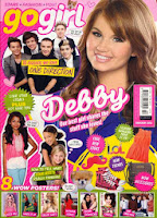
 I can tell straight away by the font that this magazine is aimed at young girls, and girls only. This is because the font 'go girl' is in italic lower cases letters and is also pink, so therefore girls would be attracted to this. The style of the font makes the writing look informal, especially because there is a heart inside of the letter o.
 Whereas I can tell that this magazine is more formal and professional by the way the font is presented. The colours that are used would be attracted by both men and women, so there isn't a specific gender audience.
Also the size of the font is important. Big font would attract the audience because it would stand out and it would be clear and understand to read and notice.
For my school magazine I need to make sure that the font I choose is professional and classy because I don't want it too look tacky and too informal. I need to make sure that it is suitable for my target audience.
Colour:
When I am making my school magazine I need to make sure that I choose the appropriate colours, not only to make it look nice and attractive but also to make sure it is suitable my target audience because otherwise they would not buy the magazine.
The choice of colour is important in any type of magazine. Colours make the magazine eye catchy and makes people want to purchase the product. If the magazine had no colour it would be dull and boring whereas if the colours used were bright and colourful it would stand out so this would attract the buyer.
Every colour has a different meaning, the colours are important because they need to appeal to the target audience and represent the magazine.
Conventions of a front cover:
Most front covers on a school magazine use one single image which denotes one or two students and it is normally a medium camera shot. They use students because it represents the school and the location of the image is normally placed in an educational environment such as a classroom or an activity in the school, this is to connote that the magazine is based on school. I will follow this convention when I create my own magazine, I want to use one student and a medium shot because I want to involve a school environment in the background.
The mise en scene of my magazine:
I need to make sure that the mise en scene for my magazine is suitable for my intended target audience. In my magazine I have two images of students, they are both females and are wearing smart and sophisticated clothing which is appropriate for sixth form. They need to represent the sixth form and the school well by the way they look because it connotes that the school is professional, important and promotes learning.


No comments:
Post a Comment